Hey there!
I am back today to share a layout I created using a sketch at Sketches In Thyme.
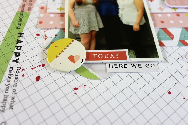
I used Pink Fresh Live More for this page of my daughter and a few friends at their Senior Dessert:
I changed up the sketch a bit by not adding strips across the top and bottom, instead I used this background paper. It reminded me of the base of the sketch. I also tilted my photo and strips.
I added some stitching through the strips of patterned papers.
I added lots of diecuts from this collection.
I also added some mist spatters.
Here is the sketch:
We would love to have you play along with us!
Enjoy your day!


Absolutely beautiful layout! Love everything about this!
ReplyDelete